Updates to the CHT UI/UX
Medic is designing, testing and developing updates to the user interface and experience design of the CHT.
We’re doing so to support improved learnability for new and existing users by aligning ourselves more closely with Android UX and material design patterns. We’re also moving to improve the CHT’s scalability by ensuring our mobile-first framework has room to support more use cases and functionality.
Some of the larger changes that we’ve tested include updating the action bar to an action button to separate positive and negative actions, and making the UI more intuitive by hinting at what primary actions a user should take on each page. The floating action button also allows for larger icons which are more recognizable to users with lower literacy.
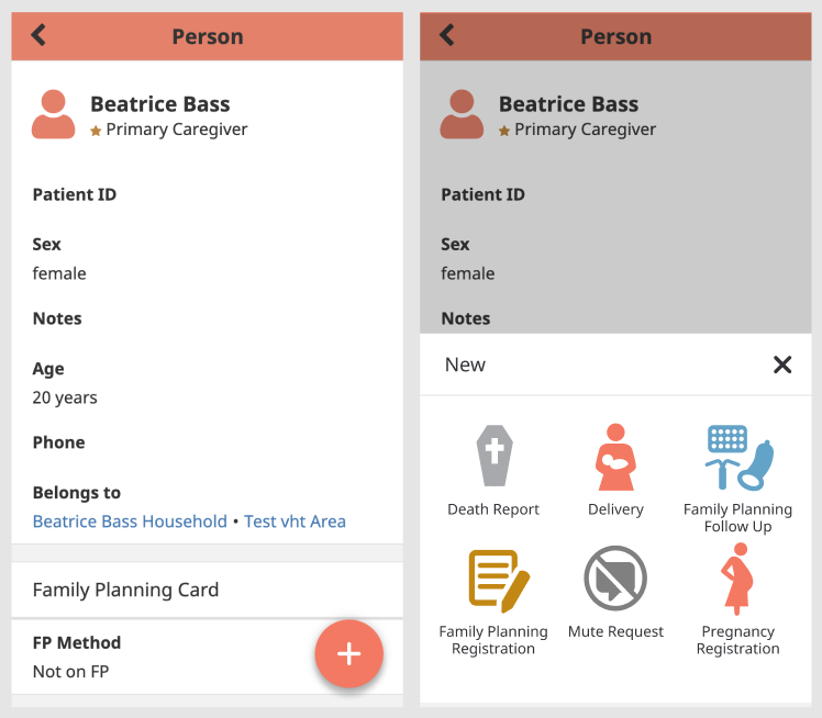
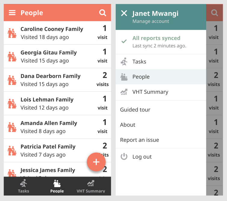
The planned navigation updates are to support better scalability by allowing the addition of new pages in the future, such as a potential home screen, and to be mobile-first. Supporting the configuration of a side drawer navigation also provides more real estate for app content for smaller screens when hidden.
What’s next?
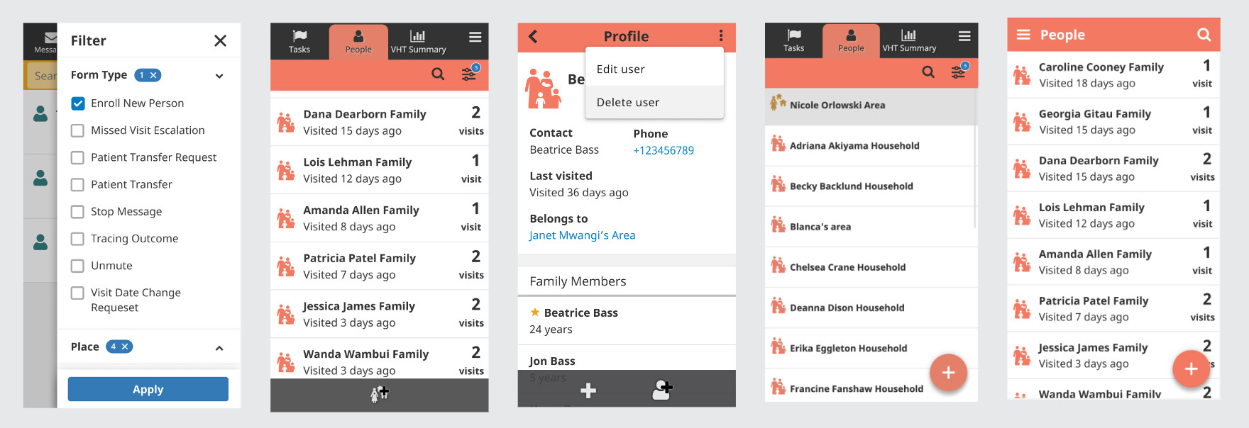
In order to support these larger improvements, there will be incremental updates, as to not overwhelm users, to smaller features such as the filter bar, search, and decoupling positive and negative actions in the action bar.
Below is an example of this potential progression. We plan on testing each update along the way and posting our learnings and iterating as needed.
As we appreciate the difficulties of training CHWs onto design updates, we are planning to help support these efforts by introducing the concept of training cards. Each UI/UX update to the CHT will come with templated and configurable content to help train users remotely.
How can you get involved?
Leave a comment if you’d like to be involved in testing these designs or have any questions about the roll out!