In the next step of our UI evolution to more closely align the CHT to Material Design and Android UX standards we are going to be updating the navigation.
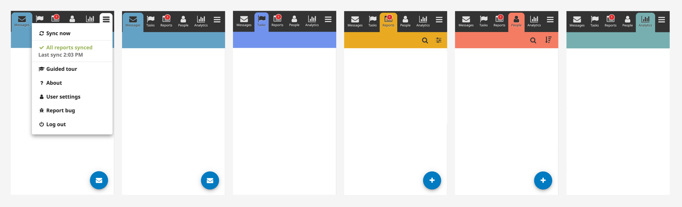
In the current version of our navigation, users tab through pages at the top of their screen and the hamburger menu opens to reveal additional items as pictured below.
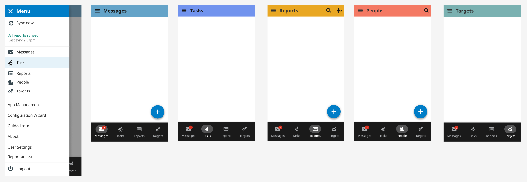
The updated navigation uses a side drawer for the menu, showing all pages available to the user. Tabs move to the bottom of the screen for easier ergonomic access and the top bar will display a larger page title and additional features such as search, filter, and more options. For users with a smaller device, the bottom tab bar can also be hidden to allow for more real estate on the screen for its main content.
As always, comments and feedback are encouraged!