As we are working on incremental updates to the UI/UX of the CHT to be more scalable, intuitive, mobile-first and consistent with other Android experiences, we are looking to test a new design of filters.
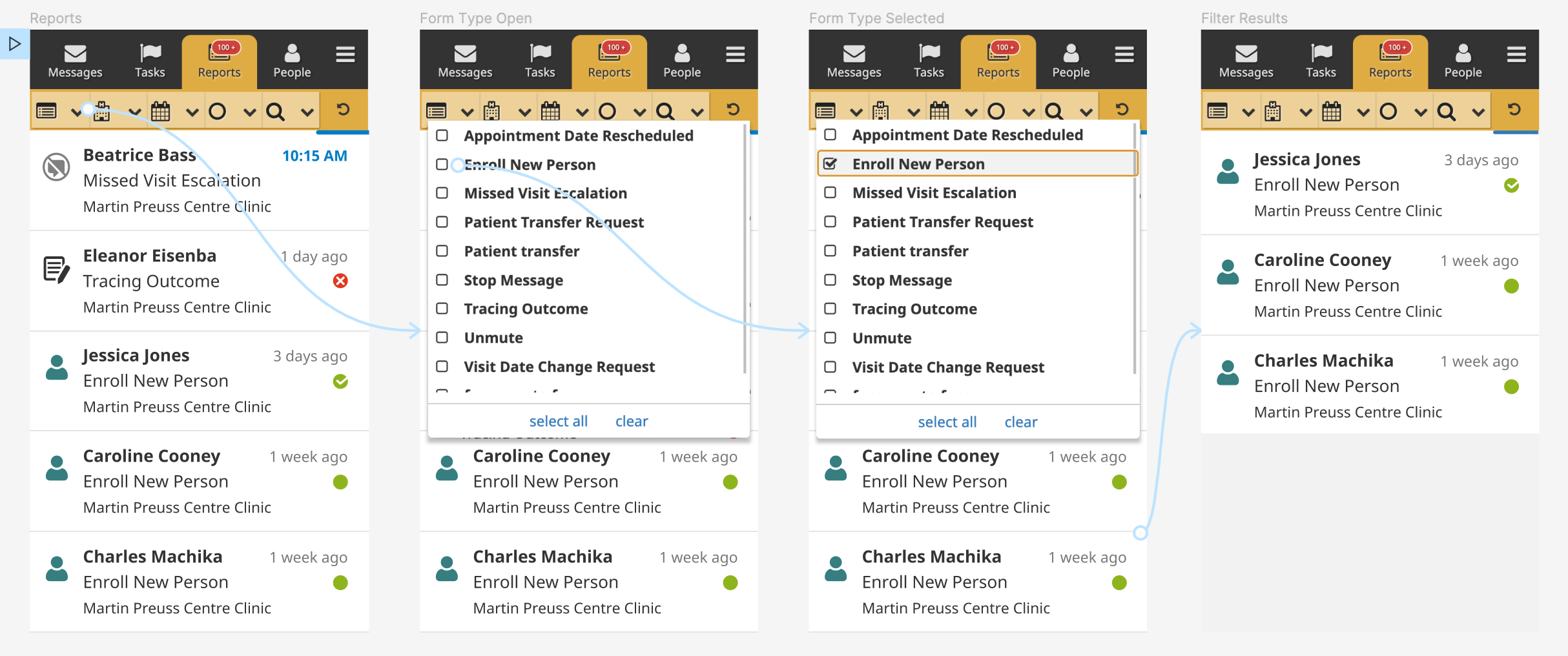
The current design allows users to select the type of filter from a row of drop downs with icons. Each filter type expands and users are able to filter content by selecting the appropriate checkboxes. The search icon expands to show a search bar.
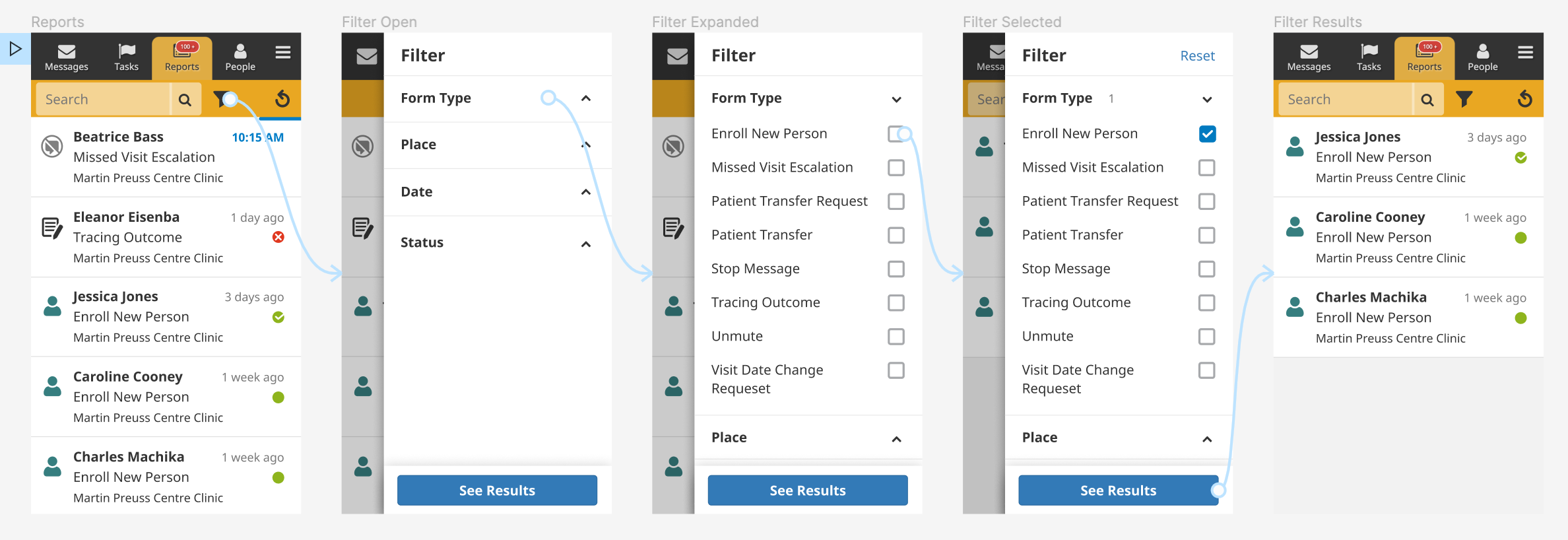
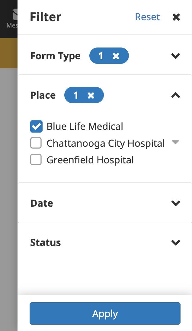
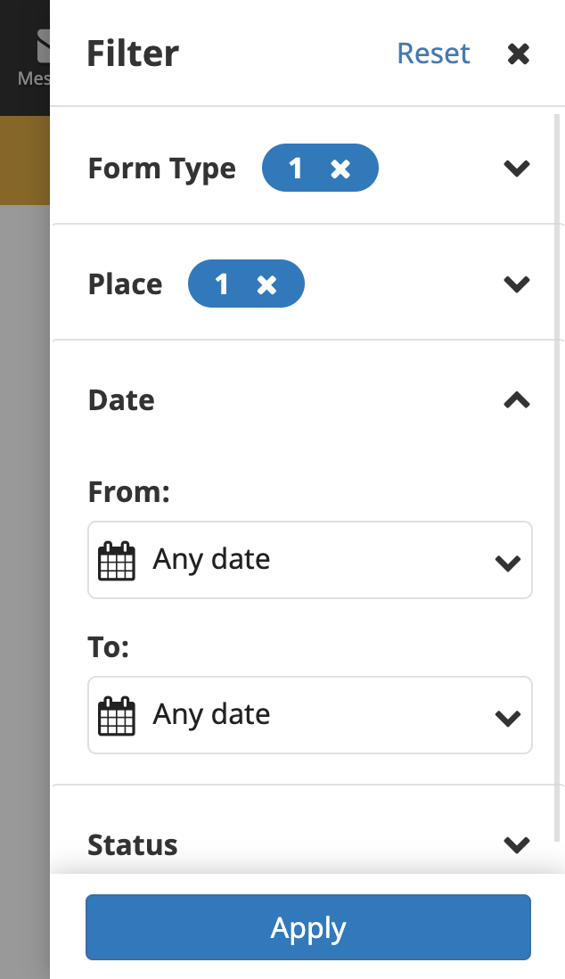
The proposed design decouples the search and filter functionalities. In this proposal, the user is able to view filters by tapping on the filter icon. This opens a drawer with a list of filter types. By tapping on the dropdown arrows, the user is able to view detailed filter options and tap on the appropriate checkboxes.
Our intention is to simplify the filtering experience by providing a cleaner interface and clearer labels that allows for better scalability. As always, any thoughts or feedback is encouraged!
If anyone is interested in testing and/or contributing to this initiative, please leave a comment below
Looks great! I’ve got a few questions.
Active Filter
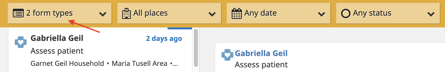
It’s nice to know if a filter is currently applied (5th screenshot on the new design). There is a visual cue for this in the current app (though you can’t see it in mobile view). Is there a design pattern for doing that with the new filter icon (ie the funnel)?
Place filter
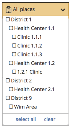
“Place” filters are tricky because there is a hierarchy element. It’s currently conveyed with indentation and can be confusing if you have many levels in your hierarch. I’m curious how it might look in the new design?
Thanks for the considerations @michael ! A visual indication of filters definitely makes sense to explore, there are a few different patters we might want to test (ex. showing only the total number of filters, showing the total and within each section, having a section at the top that shows all applied filters to easily uncheck if we find the list and usage gets complex)
As for places, this isn’t yet something we’ve looked at - thanks for bringing it to attention! Will look at what indentation looks like with the new UI and other explorations
This work has been completed and is in the 3.17 milestone.
Check out #7653 and the relevant documentation for more information.
@Nicole_Orlowski is it possible to select multiple filters at the same time? Eg I want to see all new person enrollments from catchment area A from 1st Sept through to 8th Sept 2022? If it is possible, how will it look like?
Hi @Jane_Katanu ! It is possible; the functionality remains the same as the previous filter (open each drop down and select form type, area and date).