| Date | April 25-29, 2022 |
|---|---|
| Location | Arua, Uganda |
| Participants | 16 CHWs (BRAC and MoH) |
Background
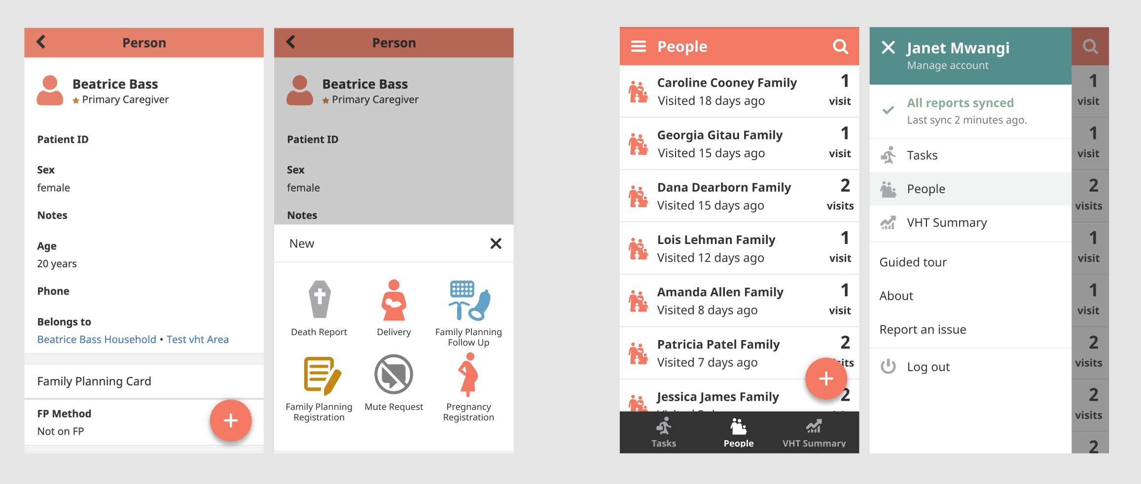
We’ve been exploring several UX/UI updates to the CHT to be more intuitive and consistent with other Android experiences. Our aim is to support its learnability with the floating action button by highlighting the primary actions a user can take on each page and its scalability by introducing a side navigation, allowing for additional pages in the future and an overall cleaner interface.
Goals
The goal of the study was to test our prototypes of the updated floating action button (FAB) and navigation designs with CHWs and to gather their feedback. We wanted to validate that the components and patterns being introduced are familiar to users and that the updated designs are usable and/or easily learnable.
Methodology
Usability test (5 participants)
Focus group discussions (11 participants)
Usability questions and results
| Question | CHW 1 | CHW 2 | CHW 3 | CHW 4 | CHW 5 | % |
|---|---|---|---|---|---|---|
| Are users familiar with the FAB? | 60 | |||||
| If not, is it easily learned? | 80 | |||||
| Will users be able to easily use bottom tabs? | 100 | |||||
| Are users familiar with the menu icon and side navigation? | 20 | |||||
| If not, is it easily learned? | 80 | |||||
| Are users familiar with the search functionality? | 20 | |||||
| If not, is it easily learned? | 100 | |||||
| Are users familiar with filtering? | 0 | |||||
| Is the combination of proposed updates going to be easy or difficult to use or learn? | 60 |
Observations
- All participants recognized where they were in the app based on the content of the screen, despite FAB/nav changes (not necessarily by recognizing page titles or highlighted tab items)
- All participants quickly recognized the open state of the FAB as their list of forms and were comfortable with the slight change in pattern from action bar to button
- All participants were able to easily transition from top to bottom tabs
- The sliding menu was the most notable change to all participants. Most participants only noticed the sync status (likely because it’s the only item they look for in the current hamburger menu). Participants needed to be prompted with a task to navigate to another page from the open menu before reading the rest of the content on the screen, but once did, remembered this new way of navigating.
- Most participants had never used the search bar and were unfamiliar with this pattern, but all became comfortable with it after one use.
- No participants were familiar with the concept of filtering and experience difficulties grasping the interaction.
- Overall, the participants with higher tech literacy were able to learn the updates more quickly whereas those with lower tech literacy struggled with learnability. Several participants mentioned training for other CHWs being necessary for these updates.
Focus group discussion questions and findings
Is the FAB easier or more difficult to use than the current action bar?
80% of participants find the FAB easier to use because
- Larger icons are easier to recognize at a glance than reading a list of text
- Iconography is often easier to understand for users with basic literacy
20% of participants find the current action bar easier to use because
- They are already trained and familiar with it
- Icons might be confusing and they prefer to read the larger text for clarity
Are bottom tabs easier or more difficult to use than top tabs?
90% of participants find the bottom tabs easier to use because
- The bottom tab is easier to reach with their thumbs
- 3 icons feel simpler than 4 (in reference to decoupling the tabs with the hamburger menu)
- The touch area feels larger
10% of participants find the top tabs easier to use because
- The difference isn’t noticeable enough and they are already comfortable with the current placement
Is a side menu easier or more difficult to use than the current navigation?
70% of participants find the side menu easier to use because
- They prefer to see all pages (current tabs and hamburger menu items) grouped
- Seeing all the ways they can do their work is preferred (again, all together), even if it takes an extra tap
- Their sync status is visible more often when they tap into the menu to change pages
30% of participants find the current navigation easier to use because
- It’s faster to switch between pages
- The side navigation feels like a big change that is difficult to learn
Observations
- Many participants thought they were being trained on app updates, however one CHW understood what we were testing and thanked us for letting him provide feedback before updates were made.
- To sync their data, participants would go into the app settings and tap “Reload” instead of using the “Sync” button in the hamburger menu.
- Again, several participants mentioned training for other CHWs being necessary for these updates.
Next steps
We will be continuing to test and share these concepts across projects and slowly begin to incrementally roll out the UI/UX updates. If you are interested in participating in usability studies with the product design team and providing feedback on upcoming CHT updates, please leave a comment with a way to get in touch.