Usability Report: Training Cards, FAB and NAV
Date June 25-29, 2023
Location Neno, Malawi
Participants 14 CHWs (Partners in Health)
Background
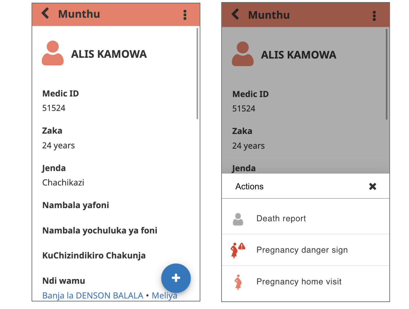
Our most recent release of v4.2.0 of the CHT-Core Framework has come with a couple of UI changes that make the CHT more intuitive and also aligns the CHT more closely with Android UX and material design patterns. These changes include a new Floating Action Bar (FAB) which opens up a menu for the primary actions (adding households, people, reports etc.), a more options menu which includes the secondary actions (edit, delete and export) at the top right side of the screen as well as training cards – a feature to help facilitate remote learning of updates to users’ CHT apps. In addition to the recent release, we are also currently working on a new navigation menu that will give the CHT a much cleaner interface, align it more closely with Android UX and also allow for scalability in the future should additional pages be introduced to the app.
Goals
Our goal was to test the prototypes of the updated UI and training cards, understand their learnability and sample CHWs reactions to the changes. We wanted to validate that the components and patterns being introduced are familiar to users, whether the updated designs are usable and/or easily learnable and to see if CHWs are able to understand new changes using training cards without further instruction.
Methodology
Usability test (14 participants)
User Interviews (14 participants)
Usability test
Training cards

Results
| Question | CHW 1 | CHW 2 | CHW 3 | CHW 4 | CHW 5 | CHW 6 | CHW 7 | CHW 8 | CHW 9 | CHW 10 | CHW 11 | CHW 12 | CHW 13 | CHW 14 | % |
|---|---|---|---|---|---|---|---|---|---|---|---|---|---|---|---|
| Have users used training cards before? | ❌ | ❌ | ✅ | ❌ | ❌ | ❌ | ✅ | ✅ | ❌ | ❌ | ✅ | ❌ | ❌ | ❌ | 29% |
| Do users understand the purpose of the training cards? | ❌ | ❌ | ✅ | ✅ | ✅ | ✅ | ✅ | ❌ | ✅ | ✅ | ✅ | ✅ | ❌ | ✅ | 72% |
| Are training cards easily learned? | ✅ | ✅ | ✅ | ✅ | ✅ | ✅ | ✅ | ❌ | ✅ | ✅ | ✅ | ✅ | ✅ | ✅ | 93% |
| Do users understand the content in the training cards? | ❌ | ❌ | ❌ | ✅ | ✅ | ❌ | ✅ | ❌ | ❌ | ✅ | ❌ | ✅ | ❌ | ✅ | 43% |
| Do users require further instructions apart from the cards? | ✅ | ✅ | ✅ | ❌ | ❌ | ✅ | ✅ | ✅ | ✅ | ❌ | ✅ | ❌ | ✅ | ❌ | 65% |
| Time to complete 5 cards (mins) | 4 | 11 | 10 | 6 | 4 | 5 | 6 | 10 | 7 | 6 | 8 | 4 | 7 | 6 | 6mins |
*score of 1 = extremely difficult; 5 = extremely easy
Floating Action Button
Results
| Question | CHW 1 | CHW 2 | CHW 3 | CHW 4 | CHW 5 | CHW 6 | CHW 7 | CHW 8 | CHW 9 | CHW 10 | CHW 11 | CHW 12 | CHW 13 | CHW 14 | % |
|---|---|---|---|---|---|---|---|---|---|---|---|---|---|---|---|
| Are users familiar with the FAB? | ❌ | ❌ | ❌ | ❌ | ✅ | ❌ | ❌ | ❌ | ❌ | ❌ | ❌ | ❌ | ❌ | ❌ | 8% |
| Are users able to add a new person with the new FAB after reading the training cards? | ✅ | ❌ | ❌ | ❌ | ✅ | ❌ | ✅ | ✅ | ✅ | ✅ | ✅ | ✅ | ❌ | ❌ | 58% |
| For users that could not add a new person above, how many learned it easily? | ✅ | ❌ | ✅ | ✅ | ✅ | ✅ | ✅ | ✅ | ✅ | ✅ | ✅ | ✅ | ✅ | ✅ | 93% |
| How easy or difficult is the task?* | 4 | 2 | 3 | 4.5 | 5 | 2 | 5 | 4 | 5 | 5 | 4 | 5 | 3 | 3 | 4 |
| Are users able to register a pregnancy with the new FAB? | ❌ | ❌ | ✅ | ✅ | ✅ | ✅ | ✅ | ❌ | ✅ | ✅ | ✅ | ✅ | ✅ | ✅ | 79% |
| For users that could not register a pregnancy above, how many learned it easily? | ✅ | ✅ | ✅ | ✅ | ✅ | ✅ | ✅ | ✅ | ✅ | ✅ | ✅ | ✅ | ✅ | ✅ | 100% |
| How easy or difficult is the task?* | 3 | 2 | 5 | 5 | 5 | 5 | 5 | 2 | 4 | 5 | 4 | 4 | 4 | 5 | 4.5 |
| Is the combination of proposed updates going to be easy to use or learn? | ✅ | ❌ | ✅ | ✅ | ✅ | ✅ | ✅ | ❌ | ✅ | ✅ | ✅ | ✅ | ✅ | ✅ | 86% |
*score of 1 = extremely difficult; 5 = extremely easy
Observations
- Most CHWs were not familiar with any of the new UI changes, however, a high percentage were very receptive to learning and adopting the changes.
- Most CHWs stated that the new Floating Action Bar was easier to use, reduced the steps to complete tasks and provided an easier and more streamlined experience.
- Most CHWs did not fully understand the content in the cards as they simply skimmed through in order to get to the end of the cards. With extra training, CHWs should be able to use training cards for remote learning.
- It was more difficult for CHWs to use the FAB for the first time, however, all of them were able to quickly adapt and found it easier to learn and use the FAB on following tasks.
- All participants stated that the new UI changes would be welcomed amongst CHWs, however, they felt that further training would be necessary for the changes.
User interviews
Updated navigation
We conducted 1:1 user interviews where we presented the CHWs with screenshots of both the current and the new navigation menu, and asked for their thoughts, feedback and reactions to this new menu in comparison to the current navigation menu.
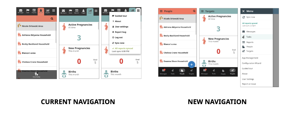
What are the differences you notice, if any?
- Icons used are different from the ones in the current app
- Navigation menu has moved from the top to bottom
- Current app does not have the sliding menu drawer
- Page titles at the top of the screen
- Hamburger menu content is different across the different versions
- Hamburger menu in the new UI has more content than the current menu
How do you feel about these changes?
100% of the participants stated that they would all be receptive to the new changes, stating that CHWs are always open to learning about new changes. They also stated that since these changes do not change the core programming of their app, the learning curve would not be very steep.
Which version do you think is easier for you to use?
100% of the participants felt that both the current and proposed versions were easy to use
- There are no major changes to the actions, just positioning of
36% of the participants felt that the new version would be easier as:
- It made the different tabs more accessible
- The “Synchronisation” button is more visible; making it easier for most people to remember to synchronize their work
Which version do you think is easier for CHWs to learn?
64% of the participants felt that the new version would be easy for current and new CHWs to learn
36% of the participants felt that current CHWs would find it difficult to learn the new UI because:
- Current CHWs are already familiar with their existing app.
- CHWs with lower tech literacy take longer to learn about new changes. They emphasized that there would be a need for new training to onboard the users to the new UI.
Observations
- CHWs were excited about being shown the changes prior to rollouts and thanked us for letting them provide their feedback. They also stated that showing them these changes before training would give them ample time to mentally prepare for a different app experience.
- At first glance, most users focused on the content on the screen and therefore stated that there was no difference between the current and new UI.
- Most participants recognized the different screens and where they were in the app based on the content of the screens and icons used, despite having the new navigation. Only 2 users identified pages based on the page titles.
- All participants noticed the sliding menu drawer as the most prominent change in the Navigation. 1 user stated that the menu drawer had a lot of information and recommended reducing it as some CHWs may get confused.
- All participants stated that the new UI changes would be welcomed amongst the CHW, however, they felt that further training would be necessary for the changes.
Next Steps
We will be continuing to test and share these concepts across projects. The FAB and Training Cards have been rolled out with version 4.2.0. If you are interested in participating in usability studies with the product design team and providing feedback on upcoming CHT updates, please leave a comment with a way to get in touch, or email ziithe@medic.org.