Over the past year we’ve been making incremental UI updates to the CHT to be more scalable, intuitive, mobile-first and consistent with other Android experiences by aligning more closely with Material Design.
Summary of the evolution:
Filters (3.17.0)
The first step of our UI evolution updated filters from icon dropdowns to an expandable drawer to simplify the experience by providing clearer labels and allowing for better scalability.
Secondly, we updated our search feature to be expandable to free up real estate in the top bar, collapsing the current bar into an icon that opens when tapped.
We then updated the bottom action bar to a Floating Action Button (FAB). This collapses the bottom bar into a single icon, providing more real estate on small screens for important content that expands into a list of actions, providing better scalability and labels.
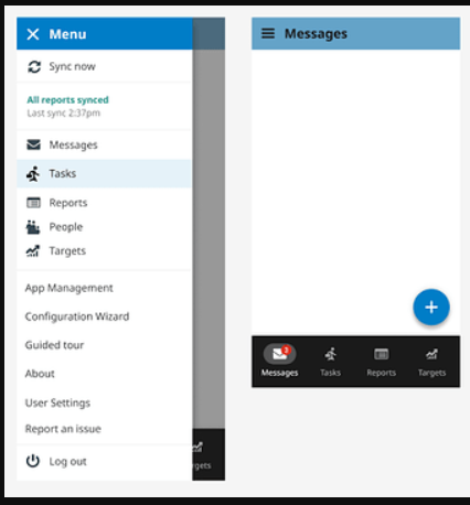
Our final step in this planned incremental update is to update the navigation. The new navigation uses a side drawer for the menu, housing all pages available to the user. Tabs move to the bottom of the screen for easier ergonomic access and the top bar features a page title, search, filter and additional secondary functionality. For smaller screens, the bottom bar can also be hidden to allow for more real estate on screens for the main content.
The navigation update is one of the more prominent UI changes. In preparation, we are seeking partners to help get the new designs in front of CHWs to determine which key functionalities are intuitive and which will need additional training and support for a more seamless transition. If you are interested in working with us on this, please reach out to orlowski@medic.org .
Would the bottom bar be hidden during form input to avoid accidental touches?
Currently, the top bar stays active on screens when a form is opened. This allows the user to quickly navigate around. However, the probability of an unintended action is much lower.
Reaching for input fields higher up on the screen might cause the thumb muscle to accidentally press the nav bar buttons. Luckily, a dialog confirming the action should still pop up:
The designs look awesome! I’m really looking forward to seeing this in the CHT.
Sorry for the confusion in my previous message. My wording and the use of the website as an example did not properly convey my concern.
When I worked in agriculture, as a mobile dev, we also moved our top bar to the bottom for better ergonomics. Unfortunately, we received quite a few complaints of missed or accidental clicks, as our users in the field would frequently touch the bottom bar buttons while filling in form content. This was seemingly due to them reaching up with their thumbs to access an input field higher up on the screen. The thumb muscle would then touch the bottom navigation bar buttons, causing frustration.
Would the bottom bar be hidden or animate out of view when an app form is opened to avoid cases like the one mentioned above on mobile?
In the example mentioned in my previous post, I attempted to reference the top navigation bar buttons on the website, suggesting that clicks on these buttons would probably be more intentional due to their placement.
Thanks for clarifying and apologies for my confusion! You’re right that when users are filling out forms the bottom bar disappears to avoid this. Hope this answers your concern!
That’s fantastic news, thanks so much for confirming!
Just a few more questions regarding the drawer menu :
Would the item ordering differ for online and offline users?
For instance as a CHW it might be advantageous to have the sync button at the bottom near the thumb (together with the last synced status).
What is the purpose of the navigation buttons in the menu, when they are already present on the nav bar?
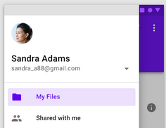
What we’ve found during our testing is that we often forget who we’re logged in as. It would be fantastic if the app followed a well know material design concept where you have a little breakdown of the top with your username/display name (profile). Perhaps a convenient location for the manage and logout button alongside/beneath it. See screenshot below. Is that something that would be considered as part of a future UI update?
As part of point 4, instead of having a entire blank page dedicated two “user setting” options, would showing a condensed dialog (pinned to the bottom of the screen) work? Both in usability and overall feel.
Having this extra space in the drawer would allow for a clear separation between:
“profile management” - mini profile info + manage btn + logout btn,
Ordering will be the same for all users for MVP (we are not looking to differ drastically from the current hamburger menu contents for our first iteration) but moving the sync to be near the thumb is something we can definitely explore as it rolls out
The initial idea was to have this be configurable, in case projects have additional pages that aren’t for primary use however for MVP we are going to keep the tabs as is on the bottom and remove them as menu items from the drawer
This is not currently something we are considering for MVP but if you have user stories around this (CHT users not knowing who they’re logged in as), I’d definitely like to hear more!
The info arch isn’t something we are addressing in this UI update however we are moving towards more scalable but cleaner designs; ideally we are keeping the bottom nav bar for primary pages only and keeping the rest in the drawer. Here’s a screenshot of what we’re starting with. How often are you accessing user settings?
That’s understandable. Is this to make the switch over less jarring to users? Creating a sense of familiarity, which will help to systematically introduce changes over time that will easily be accepted/adopted?
That is exciting! Something like linking to other websites? Or would it specifically open app forms?
I can’t say that CHWs often forget who they’re logged in as; this issue is more common among site managers or those assisting the CHWs. The problem primarily arises on the coding side. To test fixes and features, we frequently log in and out of profiles, and sometimes get sidetracked by other tasks. As a result, we occasionally forget who we’re logged in as and pick up our testing where we left off.
This is further compounded, at least in my case, by my refusal to save login credentials. Given the number of times we clear the instance, saving credentials would lead to many obsolete logins. It’s worth mentioning that our login users are created automatically via person registration using the user_for_contact functionality, which appends a random 4-digit suffix. Perhaps it was more of a cheeky request.
That’s fair enough. It makes sense to gradually move towards the end goal rather than surprise the user base with an entirely reworked UI, which would require new training for users. Thank you so much for taking the time to relay all the design decisions and information in general. Due to our circumstances mentioned above, we often open the screen to see the username, as we usually prefix our test users with the type.


 :
:
