Background
Supervisors don’t always manage all CHPs in one geographical area. To work around this, Supervisors are given multiple logins so they can switch between areas, which is a poor experience.
Participants
- 6 Supervisors from MoH Mali who are responsible for 2-3 areas
- 4 Supervisors from MoH Uganda who are responsible for 2 areas
- 6 Supervisors from MoH Kenya who are responsible for 7-12 areas
Learning Objectives
- How do Supervisors react to seeing each concept for the first time?
- How difficult or easy is each Supervisor Area concept to use?
- Which of the designs presented is the most usable?
Methodology
Remote moderated usability testing, facilitated by Medic staff.
Usability Test and Results
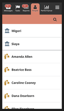
Show Everything
Imagine the scenario where you are in charge of two areas: Migori and Siaya. This design displays all of the CHWs you are responsible for, across both areas. You will also see all of your tasks you are responsible for, in both areas, together on the Task page.
Initial Reactions
- This design is easy enough to understand but the Supervisor would prefer to see the areas grouped instead of in one long list
- Although not optimal, this design still works because Supervisors know each CHP by name
- Reporting is based on community units so this design feels limiting; it might be easier to do supervision but tedious when reporting
- Usable enough but concerned about the amount of scrolling and a potential crowded Task page
Ease of Use Score
This concept scored an average of 3.8*
*score of 1 = extremely difficult; 5 = extremely easy
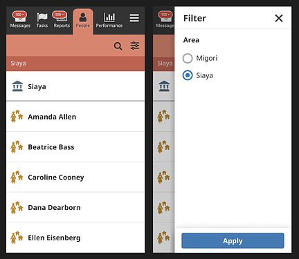
Radio Filters
This design allows you to switch between Areas using the Filter function. There is a label to indicate which Area you are currently viewing. To change Areas, you would tap on the Filter Icon to open the side drawer and select which Area you would like to see. You can only see one Area at a time.
Initial Reactions
- This better supports supervision, focusing on one area at a time
- Filtering and understanding the groupings is easy
- Much easier than the previous concept
Ease of Use Score
This concept scored an average of 3.95*
*score of 1 = extremely difficult; 5 = extremely easy
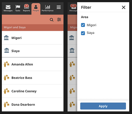
Checkbox Filters
This design allows you to select multiple Areas using the Filter function. There is a label to indicate which Area(s) you are currently viewing. To change Areas, you would tap on the Filter Icon to open the side drawer and select which Areas you would like to see. You can view multiple Areas at a time.
Initial Reactions
- This is the best design and will ease reporting as Supervisors can extract data for one or all of their areas
- The least limiting concept presented
- It’s easy to recognize which areas are selected
Ease of Use Score
This concept scored an average of 4.5*
*score of 1 = extremely difficult; 5 = extremely easy
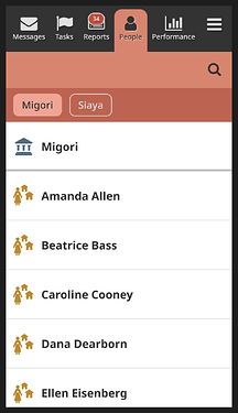
Chips
This design allows you to select multiple Areas using Chips. The selected Chips indicate which Area(s) you are currently viewing. To change Areas, you would tap on the Chip to select or deselect the Area. You can view multiple Areas at a time.
Initial Reactions
- The design more straightforward for those people who are not good with filters but might look crowded if one has many Areas
- Selecting the Areas is simpler and faster than opening the filter
Ease of Use Score
This concept scored an average of 4.4*
*score of 1 = extremely difficult; 5 = extremely easy
Conclusion
All design concepts for Supervisor Areas were usable to our participants and an improvement from the current experience of using different logins.
Checkbox Filters scored the easiest to use, skewed by Supervisor participants who are responsible for 7 or more Areas.
Chips came in at a close second, preferred by Supervisors responsible for 2 Areas for its ease of use in terms of less taps.


