In the CHT App (eCHIS) being used in Uganda, there are 2 icons for creating a new household (family). The 1st one is directly under the Contact tab and the 2nd is under the profile of the CHW. The support team noticed that the 2 icons were confusing the CHWs (VHTs in Uganda) and are suggesting that we hide the 2nd one under the CHW profile. Can this be achieved at config level?
Hello @pkitutu this behavior seems related to the hierarchy configuration. Review the parents under the contact_types object to see how it affects the cascade.
The happy path should result in one household icon under the VHT area.
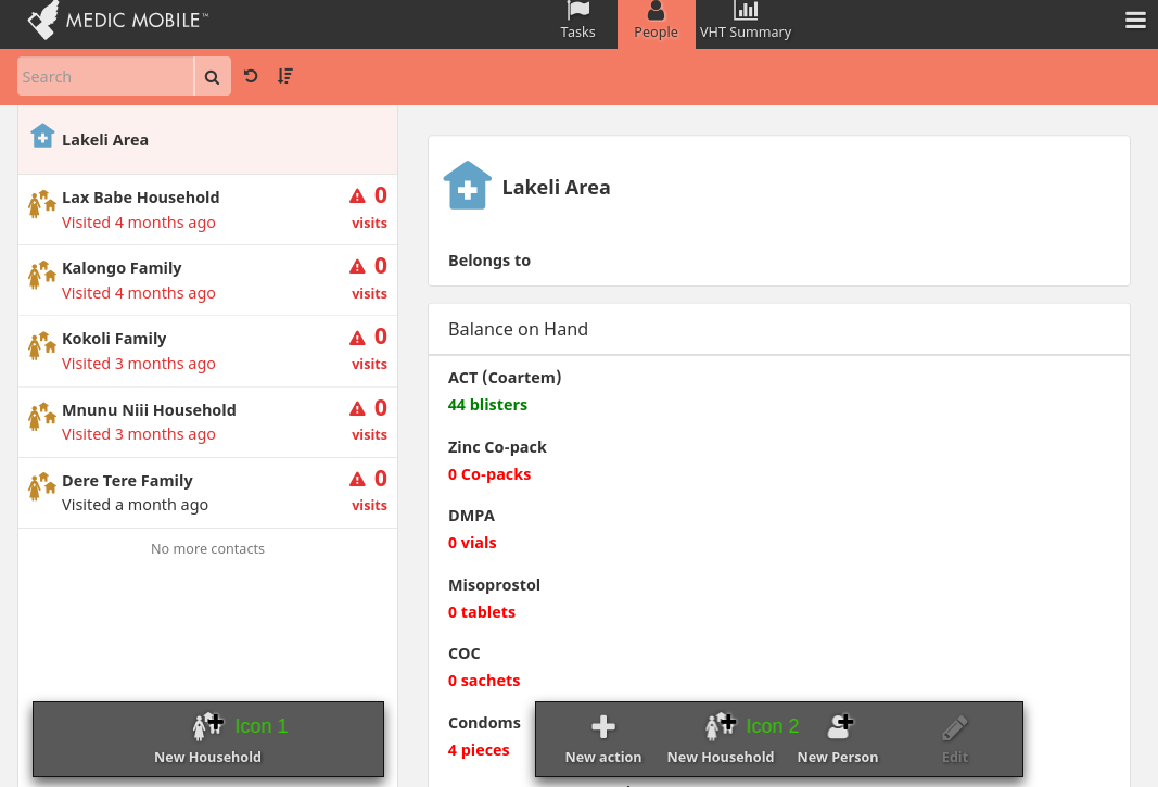
I’ve had a look and It looks like it is not possible. In the pic below, it is Icon 2 (button) that we need to hide as it is playing the same role as icon 1
Thanks for adding the screenshot, as it helps to understand the situation.
The support team noticed that the 2 icons were confusing the CHWs (VHTs in Uganda) and are suggesting that we hide the 2nd one under the CHW profile.
Can you describe more the effects of having the icon in both places? And on the flip side, what would the effect be if you only had one icon? My initial gut feeling is that the trade-offs might not warrant hiding one of the icons only when on the top level place, but getting more info will help to better understand the situation and explore other ways to support users.
CCing Nicole_Orlowski, @leah, and @michael to consider this as well.
Also… from the video around 1m11s it mentions adding a new person directly under the area. What is the purpose of adding new people directly under an area and not within a household? Is that intentional?